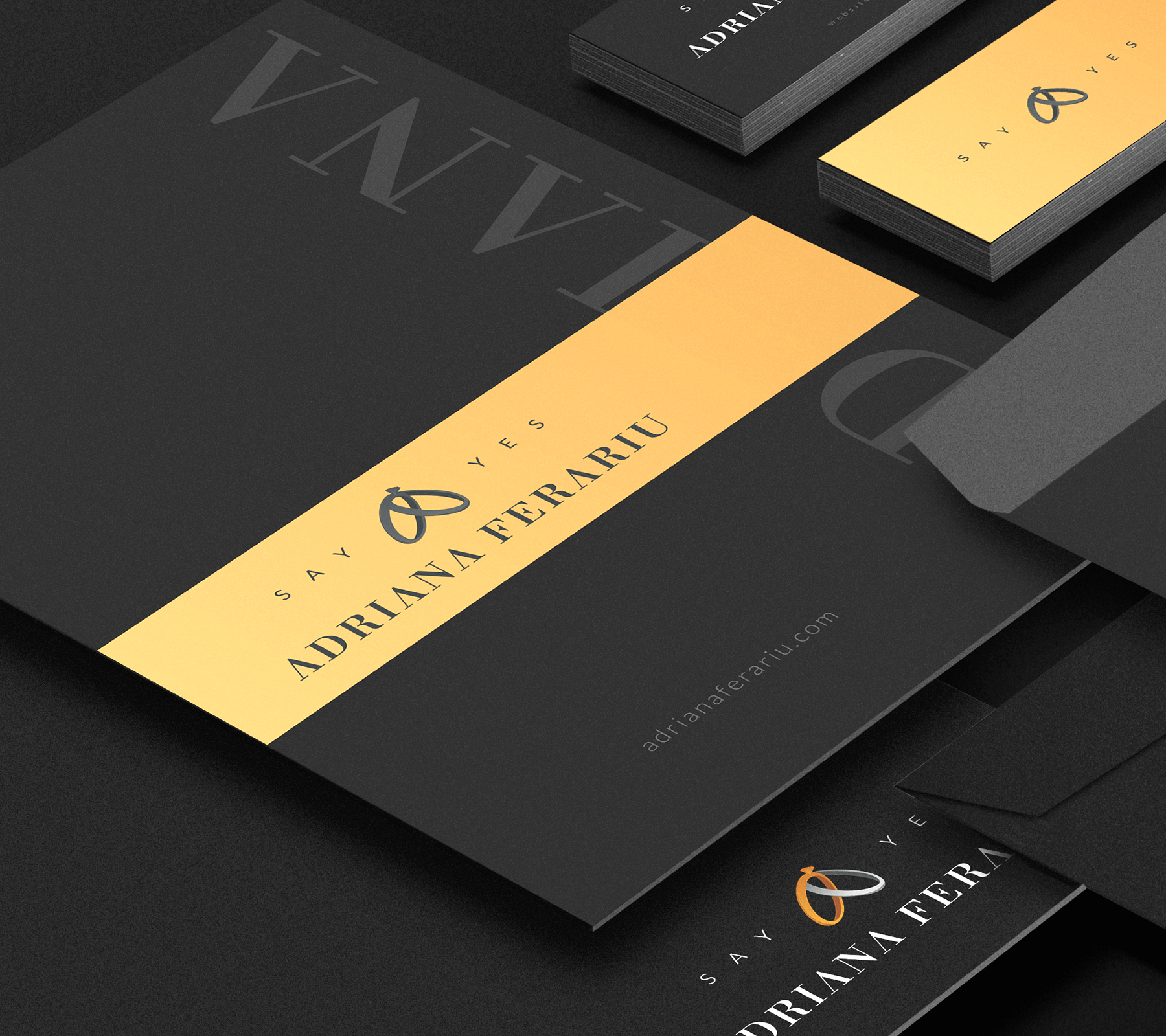


Designing a brand that is simple enough to recognise, yet with a personal touch, by having to merge the name of the owner with a clear CTA tagline without it looking to corporate.
Branding
Summer 2019

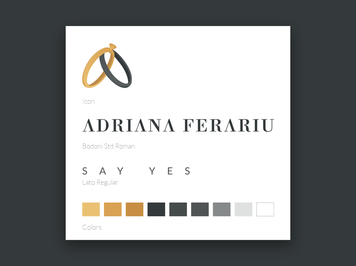
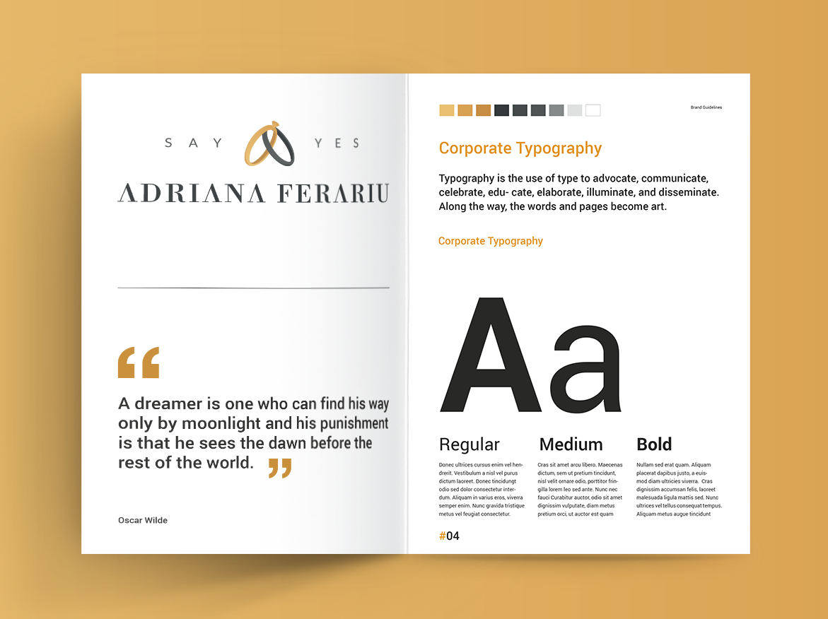
The most desirable solution was using an A letter icon formed by 2 wedding rings that represent the industry client is activating in. Based on that a full branding guidelines document was developed.
